

Recently, I've been reading a lot of webcomics where character stats are shown on radar charts.
I've also been playing around with d3 for a while now, so I decided to see how I could create a radar chart from scratch using this awesome library.
As an additional bonus, I also decided that the chart had to be built with polygons. Could I have made it easier on myself by using circles only? Probably 🤷🏽♀️.
In this tutorial, I used CSS to style my charts, but feel free to use javascript to add styles wherever possible.
This tutorial assumes basic knowledge of d3
HTML CODE
<!DOCTYPE html>
<html lang="en">

    <head>
        <meta charset="UTF-8">
        <meta name="viewport"
            content="width=device-width, initial-scale=1.0">
        <title>Radar Chart</title>
        <link rel="stylesheet"
            href="./style.css">
    </head>

    <body>
        <div class="chart">
            <div class="tooltip"></div>
        </div>

        <script src="./lib/d3/d3.min.js"></script>
        <script src="./index.js"></script>
    </body>

</html>
As you can see, the HTML is fairly straightforward, I linked the d3 library, my custom CSS and JS files.
I also created a div with a class of chart and another with a class tooltip
The chart div is where our SVG code will be added, and the tooltip div will display some data when we add event listeners to the chart.
Styles to be found here. Nothing much going on there either, just basic styles for the chart
Coding the chart
I'm going to define some variables that will be useful to us later on.
const NUM_OF_SIDES = 5,
    NUM_OF_LEVEL = 4,
    size = Math.min( window.innerWidth, window.innerHeight, 400 ),
    offset = Math.PI,
    polyangle = ( Math.PI * 2 ) / NUM_OF_SIDES,
    r = 0.8 * size,
    r_0 = r / 2,
    center =
    {
        x: size / 2,
        y: size / 2
    };

const wrapper = d3.select( ".chart" )
    .append( "svg" )
    .attr( "width", size )
    .attr( "height", size );

const g = d3.select( "svg" ).append( "g" );
Explanation
NUM_OF_SIDES = The number of sides of our polygon.
NUM_OF_LEVEL = The number of levels we want.
size = The width and height of our SVG wrapper.
polyangle = size of the angle created at the center of the drawing area by each polygon side. The sum of angles at a point is 360 degrees or 2 * Math.PI radians. For a regular polygon, ( i.e the length of all sides of the polygon are equal ) each side would create an angle of size 2 * Math.PI / NUM_OF_SIDES radians .
offset = We want our polygon to start at the top, like a clock. So we need to shift our points by this angle.
r = Distance between center and edge of the drawing area.
r_0 = Maximum allowable distance from center to the edge of a polygon. We want to draw labels, so we need to give a little gap between our chart area and the edge of the drawing area
center = As you know, SVG coordinates start at the top left, we want to move that center to the middle of our drawing area.
To draw a polygon radar chart, we need polygons.
You need two things to draw a polygon
- length of each polygon side and,
- the coordinates of the polygon vertices
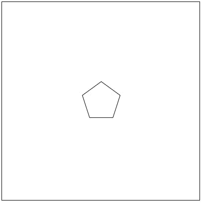
Generating the coordinates of the vertex requires us to know the angle that the vertex will make with the center of our polygon.
Let's create a function for getting points
const generatePoint = ( { length, angle } ) =>
{
    const point =
    {
        x: center.x + ( length * Math.sin( offset - angle ) ),
        y: center.y + ( length * Math.cos( offset - angle ) )
    };
    return point;
};
What's happening here?
From the image above, using basic trigonometry, we get x and y as
x = length * Sin(angle)
y = length * Cos(angle)
Making sure that we start at the center of our drawing area, we add our center to x and y
We want our first point to start at the top so we offset our angles by 90 degrees { or (Math.PI /2 ) radians } which is defined as our offset variable.
Now that we can generate a point, we need to generate all the vertices of our polygon
 let points = [];  const length = 100;
        for ( let vertex = 0; vertex < sideCount; vertex++ )
        {
            const theta = vertex * polyangle;

            points.push( generatePoint( { length, angle: theta } ) );

        }
To actually draw these points, we need a drawing function.
Let's do that
const drawPath = ( points, parent ) =>
{
    const lineGenerator = d3.line()
        .x( d => d.x )
        .y( d => d.y );

    parent.append( "path" )
        .attr( "d", lineGenerator( points ) );
};
parent = SVG we want to attach our polygon to.
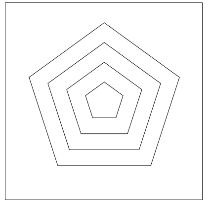
If we run this code, we get this
Why is this happening?
Remember, our drawPath function draws a path for us based on the points provided. Closing the path requires that we duplicate the first point and append it to our points array.
points = [...points,points[0]];
drawPath(points,g);
Now we have a polygon, 🎉🎉🎉 🎉
Drawing a chart requires data. We also want to include our axis with tick marks, so let's generate some data and ticks.
Our code base will look like so
const NUM_OF_SIDES = 5;
NUM_OF_LEVEL = 4,
    size = Math.min( window.innerWidth, window.innerHeight, 400 ),
    offset = Math.PI,
    polyangle = ( Math.PI * 2 ) / NUM_OF_SIDES,
    r = 0.8 * size,
    r_0 = r / 2,
    center =
    {
        x: size / 2,
        y: size / 2
    };


const tooltip = d3.select( ".tooltip" );

const generateData = ( length ) =>
{
    const data = [];
    const min = 25;
    const max = 100;

    for ( let i = 0; i < length; i++ )
    {
        data.push(
            {
                name: "Label",
                value: Math.round( min + ( ( max - min ) * Math.random() ) )
            }
        );
    }

    return data;
};

const genTicks = levels =>
{
    const ticks = [];
    const step = 100 / levels;
    for ( let i = 0; i <= levels; i++ )
    {
        const num = step * i;
        if ( Number.isInteger( step ) )
        {
            ticks.push( num );
        }
        else
        {
            ticks.push( num.toFixed( 2 ) );
        }
    }
    return ticks;
};

const ticks = genTicks( NUM_OF_LEVEL );
const dataset = generateData( NUM_OF_SIDES );

const wrapper = d3.select( ".chart" )
    .append( "svg" )
    .attr( "width", size )
    .attr( "height", size );

const g = d3.select( "svg" ).append( "g" );

const scale = d3.scaleLinear()
    .domain( [ 0, 100 ] )
    .range( [ 0, r_0 ] );

...

points = [...points,points[0]];
drawPath(points,g);
generateData will return a different collection every time, we run the code.
scale will help normalize our data so that it fits on our chart.
The length of the dataset will correspond to the number of sides of the polygon, which in our case is 5
Before we move on, let's take a sneak peek at the final chart.

Let's list the things we need to do to draw the chart
- Generate and draw the polygon levels
- Generate and draw the lines extending from the center
- Generate and draw the chart axis
- Draw the data
- Draw the labels
We can create a function for each task
1. Generate and draw the polygon levels
...

const generateAndDrawLevels = ( levelsCount, sideCount ) =>
{

    for ( let level = 1; level <= levelsCount; level++ )
    {
        const hyp = ( level / levelsCount ) * r_0;

        const points = [];
        for ( let vertex = 0; vertex < sideCount; vertex++ )
        {
            const theta = vertex * polyangle;

            points.push( generatePoint( { length: hyp, angle: theta } ) );

        }
        const group = g.append( "g" ).attr( "class", "levels" );
        drawPath( [ ...points, points[ 0 ] ], group );
    }


};

generateAndDrawLevels( NUM_OF_LEVEL, NUM_OF_SIDES );
Using our code from before, when we drew a single polygon, we generate one polygon per level. The size of each polygon is calculated as the ratio of the current level to the total number of levels multiplied by r_0
Our output now looks like this
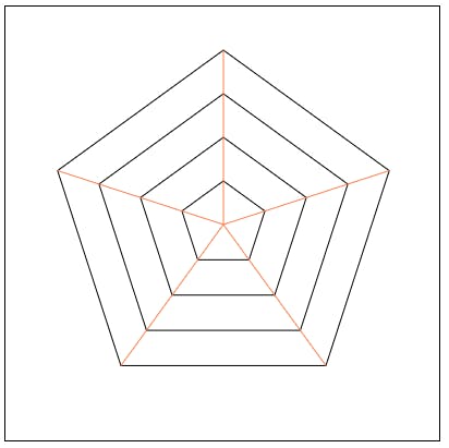
2. Generate and draw the lines extending from the center
...

const generateAndDrawLines = ( sideCount ) =>
{

    const group = g.append( "g" ).attr( "class", "grid-lines" );
    for ( let vertex = 1; vertex <= sideCount; vertex++ )
    {
        const theta = vertex * polyangle;
        const point = generatePoint( { length: r_0, angle: theta } );

        drawPath( [ center, point ], group );
    }

};


generateAndDrawLevels( NUM_OF_LEVEL, NUM_OF_SIDES );
generateAndDrawLines( NUM_OF_SIDES );
theta is acting as the angle between the line and a vertical line drawn through the middle of our chart
We should have this now
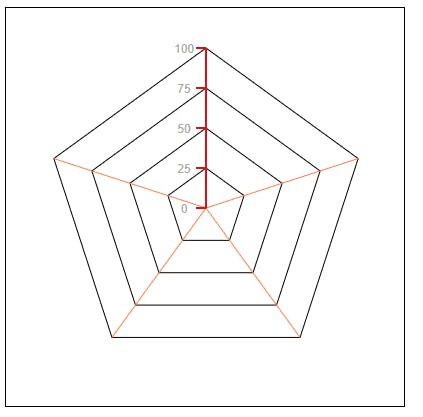
3. Generate and draw the chart axis
...

const drawText = ( text, point, isAxis, group ) =>
{
    if ( isAxis )
    {
        const xSpacing = text.toString().includes( "." ) ? 30 : 22;
        group.append( "text" )
            .attr( "x", point.x - xSpacing )
            .attr( "y", point.y + 5 )
            .html( text )
            .style( "text-anchor", "middle" )
            .attr( "fill", "darkgrey" )
            .style( "font-size", "12px" )
            .style( "font-family", "sans-serif" );
    }
    else
    {
        group.append( "text" )
            .attr( "x", point.x )
            .attr( "y", point.y )
            .html( text )
            .style( "text-anchor", "middle" )
            .attr( "fill", "darkgrey" )
            .style( "font-size", "12px" )
            .style( "font-family", "sans-serif" );
    }

};

const drawAxis = ( ticks, levelsCount ) =>
{
    const groupL = g.append( "g" ).attr( "class", "tick-lines" );
    const point = generatePoint( { length: r_0, angle: 0 } );
    drawPath( [ center, point ], groupL );

    const groupT = g.append( "g" ).attr( "class", "ticks" );

    ticks.forEach( ( d, i ) =>
    {
        const r = ( i / levelsCount ) * r_0;
        const p = generatePoint( { length: r, angle: 0 } );
        const points =
            [
                p,
                {
                    ...p,
                    x: p.x - 10
                }

            ];
        drawPath( points, groupL );
        drawText( d, p, true, groupT );
    } );
};

generateAndDrawLevels( NUM_OF_LEVEL, NUM_OF_SIDES );
generateAndDrawLines( NUM_OF_SIDES );
drawAxis( ticks, NUM_OF_LEVEL );
Phew, that's quite a bit of code, but it's fairly simple.
Using our pointGenerator function we determine the position of out tick lines and tick texts, then we draw them using drawPath and drawText functions.
drawText will also be used to draw our labels later.
I hardcoded some numbers in the drawText function. You'll have to run the code and test to find values that match your use case
Our chart now looks like this
We've done well, why don't we take a break and congratulate ourselves on the progress we made so far.
...and we're back.
Let's actually draw our data
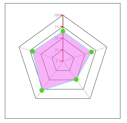
4. Draw the data
...
const drawCircles = points =>
{
    const mouseEnter = d =>
    {
        tooltip.style( "opacity", 1 );
        const { x, y } = d3.event;
        tooltip.style( "top", `${ y - 20 }px` );
        tooltip.style( "left", `${ x + 15 }px` );
        tooltip.text( d.value );
    };

    const mouseLeave = d =>
    {
        tooltip.style( "opacity", 0 );
    };

    g.append( "g" )
        .attr( "class", "indic" )
        .selectAll( "circle" )
        .data( points )
        .enter()
        .append( "circle" )
        .attr( "cx", d => d.x )
        .attr( "cy", d => d.y )
        .attr( "r", 8 )
        .on( "mouseenter",  mouseEnter )
        .on( "mouseleave",  mouseLeave );
};

const drawData = ( dataset, n ) =>
{
    const points = [];
    dataset.forEach( ( d, i ) =>
    {
        const len = scale( d.value );
        const theta = i * ( 2 * Math.PI / n );

        points.push(
            {
                ...generatePoint( { length: len, angle: theta } ),
                value: d.value
            } );
    } );

    const group = g.append( "g" ).attr( "class", "shape" );

    drawPath( [ ...points, points[ 0 ] ], group );
    drawCircles( points );
};

generateAndDrawLevels( NUM_OF_LEVEL, NUM_OF_SIDES );
generateAndDrawLines( NUM_OF_SIDES );
drawAxis( ticks, NUM_OF_LEVEL );
drawData( dataset, NUM_OF_SIDES );
Explanation
Each item in our dataset has a value property.
We scale each value to fit our chart and then get a point. The collection of coordinates can then be used to draw a polygon.
I also added markers that show a tooltip, when you hover on them, using the drawCircles function.
Code output
- Draw the labels
We're almost done, all that's left is to label the lines of our chart. See code and output below
...
const drawLabels = ( dataset, sideCount ) =>
{
    const groupL = g.append( "g" ).attr( "class", "labels" );
    for ( let vertex = 0; vertex < sideCount; vertex++ )
    {

        const angle = vertex * polyangle;
        const label = dataset[ vertex ].name;
        const point = generatePoint( { length: 0.9 * ( size / 2 ), angle } );

        drawText( label, point, false, groupL );
    }
};

generateAndDrawLevels( NUM_OF_LEVEL, NUM_OF_SIDES );
generateAndDrawLines( NUM_OF_SIDES );
drawAxis( ticks, NUM_OF_LEVEL );
drawData( dataset, NUM_OF_SIDES );
drawLabels( dataset, NUM_OF_SIDES );
That's it.
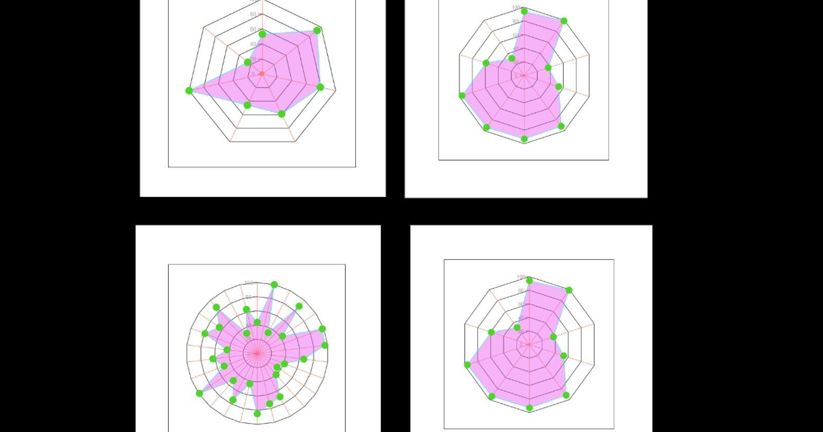
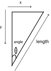
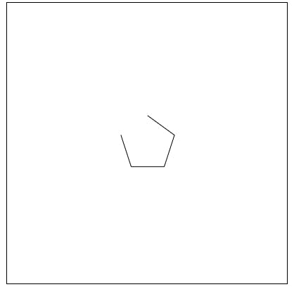
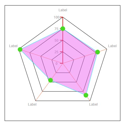
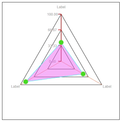
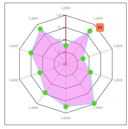
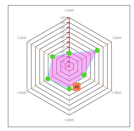
Here's my output for different configurations
3 sides and 3 levels
10 sides and 4 levels
6 sides and 10 levels
For the full code see here
The demo is here
Hope you had fun? Until next time, happy coding.
Don't forget to like and share.